I’ve started this blog to help organize my thoughts relative to data science, machine learning, statistics, logic-based analysis, and various visualization tools. The focus will be on data-related tools and techniques. While I’ll keep these posts applicable to a wide (data-interested) audience, I’m sure the analysis will occasionally focus on Salt Lake City, where I’m currently based.
To kick things off, I wanted to post a choropleth I’ve made using D3, showing diabetes rates for each county in the US. D3, or data-driven documents, is a Javascript library used to make browser-based and data-driven plots. Developed by Mike Bostock, D3 is free, interactive, and (with a little work) creates fantastic visualizations. While I used Python’s matplotlib and the latter’s basemap package in grad school to make geographic figures of the earth and atmosphere, I always wanted a tool that easily plotted data related to finer scale political boundaries. Its ability to make such maps is one first things that caught my eye about D3.
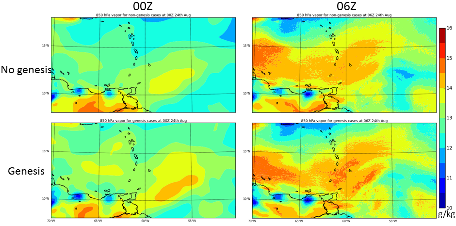
To provide a flavor of what Python-based geo-centric maps can do, here’s a plot of composite hurricane environments with atmospheric water vapor data overlaid, all using basemap:
And here’s diabetes rates by county throughout the US.
While the atmospheric data is on a finer scale of 3 km, the D3 image is based on county-level data. One of the great things about the D3 image, however, is that it simply reads from a csv file and any county-level data can easily be substituted in (and there’s no need for a corresponding lat/lon component, as in the basemap plot).
Lastly! Note the interactivity of the D3 plot. A mouseover highlights individual counties and shows their respective diabetes rates. Since I chose diabetes just to help demonstrate what D3 can do, I’ll let you examine the figure and draw your own conclusions. Note: the basic example on which this D3 choropleth is based is found here. Many other interesting examples are found here.