Using NLP, Python, and Plotly for product error triage
Let’s talk about NLP. While we’ve discussed Twitter sentiment analysis here and stylometry (or authorship attribution) here, we’ve yet to discuss document categorization. This encompasses tasks like spam filtering, automatic email routing, and language identification. From a product development perspective, one of the most useful cases for document categorization (or topic modeling, to be more precise) is error report cluster analysis (or, error triage).
Think of it this way. If your products are phoning home and you’re receiving hundreds or thousands of error reports, without NLP it’s going to be near impossible to efficiently extract value out of them. For example, what if you want to know if most of your products’ errors are on two or three or four topics? Or if most reports on one topic are reporting same exact error? Or how the errors from one client vary from another (both in terms of number of clusters and their concentrations)? Knowing this would likely tighten the feedback loop between data collection and your product feature road map.
How can we use Python to demonstrate how this is done? We start with newsgroups. Remember these, from the 1990s? Python’s scikit-learn library has done us the favor of providing a few thousand messages from ~20 newsgroups. I’ve taken around two thousand of these messages scattered across three newsgroups
comp.graphics
rec.sport.baseball
talk.religion.misc
Fairly varied topics, for sure. While error reports won’t be quite as clean, these steps will work even if you don’t know the number of clusters ahead of time.
First load the data into a dataframe. While I do this via scikit, you’ll likely load this data from a database or CSV file:
[code language=”Python”] remove = (‘headers’, ‘footers’, ‘quotes’) categories = [‘comp.graphics’, ‘rec.sport.baseball’, ‘talk.religion.misc’] newsob = fetch_20newsgroups(subset=’all’, categories=categories, shuffle=True, random_state=42, remove=remove #
Split data into text, and newsgroup name/num prior before creating df features = [newsob.data[x].replace(“\n”,””) for x in range(0,len(newsob. newsgroup_num = newsob. newsgroup_name = [categories[x] for x in newsob. df = pd.DataFrame({‘features’: features, ‘newsgroup_num’: newsgroup_num, ‘newsgroup_name’: newsgroup_name})[/code] As with almost any NLP project using scikit, one needs to turn the text into numbers. I like the straightforward bag of words approach, which tokenizes words or phrases, counts the number of occurrences in each separate document (eg, error message), and then normalizes the weights. See here for more. To achieve this last normalization step, I use TfidfVectorizer over CountVectorizer, as it diminishes in importance the words or phrases that occur across most of the documents. [code language=”Python”] # Note that the stop_words is crucial to the analysis t = TfidfVectorizer(stop_words=’english’) Xdata = t.fit_transform(df[‘features’]).todense()[/code] Before categorizing and viewing your individual errors, one must first use an elbow plot to see how many clusters exist in the combined text overall. What this plot does is show you (per extra cluster) how much the in average within-cluster sum of squares decreases. Since one prefers fewer clusters, as soon as the decrease in the within-cluster sum of squares slows–this is where the elbow comes in–that’s how many clusters make sense to have in our categorization. Here’s the relevant code (see here for the source) and figure: [code language=”Python”] ##### cluster data into K=1..10 clusters ##### K = range(1,10) KM = [kmeans(Xdata,k) for k in K] centroids = [cent for (cent,var) in KM] # cluster centroids D_k = [cdist(Xdata, cent, ‘euclidean’) for cent in centroids] cIdx = [np.argmin(D,axis=1) for D in D_k] dist = [np.min(D,axis=1) for D in D_k] avgWithinSS = [sum(d)/Xdata.shape[0] for d in dist] # plot elbow curve fig = plt.figure() ax = fig.add_subplot(111) ax.plot(K, avgWithinSS, ‘b*-‘) plt.grid(True) plt.xlabel(‘Number of clusters’) plt.ylabel(‘Average within-cluster sum of squares’) plt.title(‘Elbow for KMeans clustering’) plt.savefig(‘NewsgroupElbow.png’) plt.show()[/code]
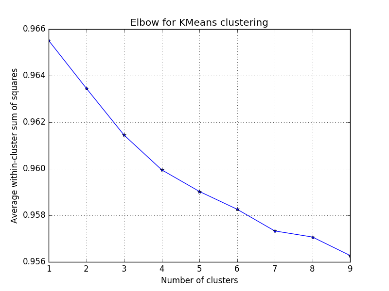
Notice that the decrease slows at the third cluster, which makes sense as we’re using three newsgroups. Wherever you see an equivalent elbow, choose that number for the following analysis. (Note that here there is larger decrease at four, which could mean there are ~four topics over the three newsgroups.) Before making sense of what the clustering algorithm might do, we first have to reduce the dimensionality of the dataset (or matrix), as it’s currently 2,585 rows (or documents) and 38,466 columns (or unique words across the entire set). To visualize this, of course, we have to take it down to three dimensions (from ~38k). [code language=”Python”] pca = PCA(n_components=3) X3d = pca.fit_transform(Xdata)[/code] Note that this could also have been done with several other matrix factorization methods found here. Next we use the KMeans to find the clusters within the 2,595 text snippets and add the cluster label to our original dataframe: [code language=”Python”] km = KMeans(n_clusters=3, random_state=1) km.fit_transform(X3d) df[‘kmeans_cluster’] = km.labels_[/code] Next we create and call a function that uses plotly to help us visualize these 2K+ text snippets in a 3d-space, colored by the cluster that was just assigned. [code language=”Python”] def plot_cluster(points, label, cluster): scatter = dict( mode = “markers”, #name = “y”, type = “scatter3d”, x = points[:,0], y = points[:,1], z = points[:,2], text = “Newsgroup: “ + label, marker = dict( size=2, color=cluster ) ) layout = dict( title = ‘3d point clustering’, hovermode = ‘closest’, autosize=True, scene = dict( xaxis = dict( zeroline=False ), yaxis = dict( zeroline=False ), zaxis = dict( zeroline=False ), ) ) fig = dict( data=[scatter], layout=layout) url = py.plot(fig, filename=’3d point clustering’) # Calling the function plot_cluster(X3d, df[‘newsgroup_name’], df[‘kmeans_cluster’])[/code] And here’s the corresponding (interactive) figure. Click to enlarge, rotate, zoom, etc.

Notice the three main features nicely represent posts from the three newsgroups used in the analysis. While your product error data likely won’t be as clean, your clustering algorithm will likely do well enough to answer questions about your products, such as which type of errors occur most often; how often and which of these errors are identical; and how many categories of errors exist overall (broken down by particular clients and/or product). Note that the hoverhelp provides newsgroup name here, but could include error details such as word count, number of occurrences, client name, product name, or an error severity score, among others. Good luck and please let me know how I can improve these methods!
Note: my figure above uses square symbols to designate those posts (or documents) that were miscategorized–note that, as expected, these occurred where the three newsgroups had the most overlap. Product error data from the wild won’t have the ability to do this. Other possible enhancements to be made 1) For actual product errors, one can use the symbol size to designate the number of errors that are exactly the same (and thus at the exact same spot) and 2) Would be helpful to list the ten most important words that typify (or that lead to) each cluster being what it is.